Visual Brand Identity
collaborators
Client Loam
Typefaces GT Super Display Bold, GT Alpina Thin Italic, Apercu
Loam
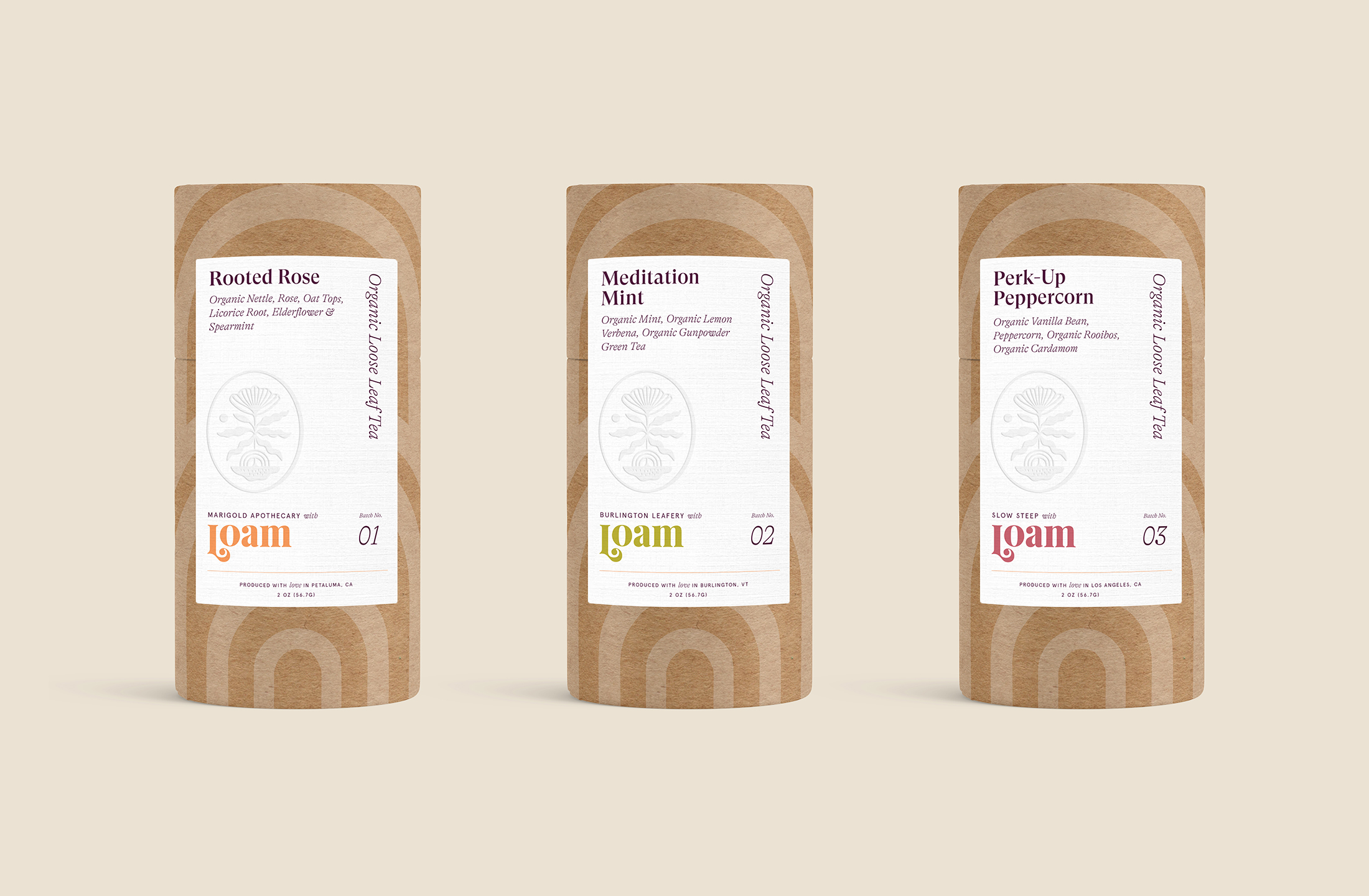
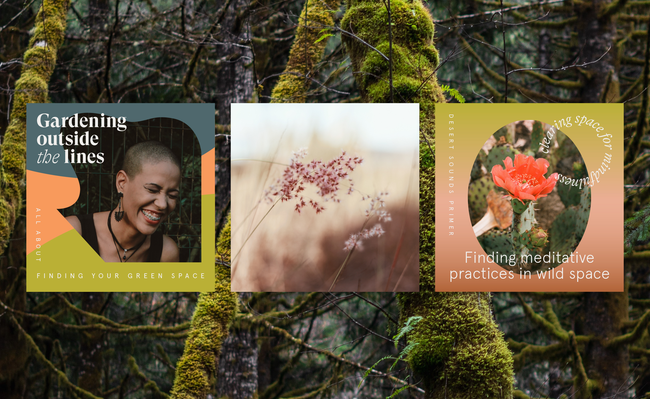
Loam is a “movement of compassionate and creative activists who strive to support one another as we find our footing in the heart of the climate crisis.” Though the Loam team knew where they wanted to go, they needed help visually sharing their “juicy, artful ethos.” Cue: a new cohesive visual brand system that their team could use for publishing work, workshops, all things digital, and any other things they could dream up!
And it’s working — after the rebrand, their YOY profits tripled and they have grown their distributor relationships due to their unique look. All so they can continue to grow and support their community.
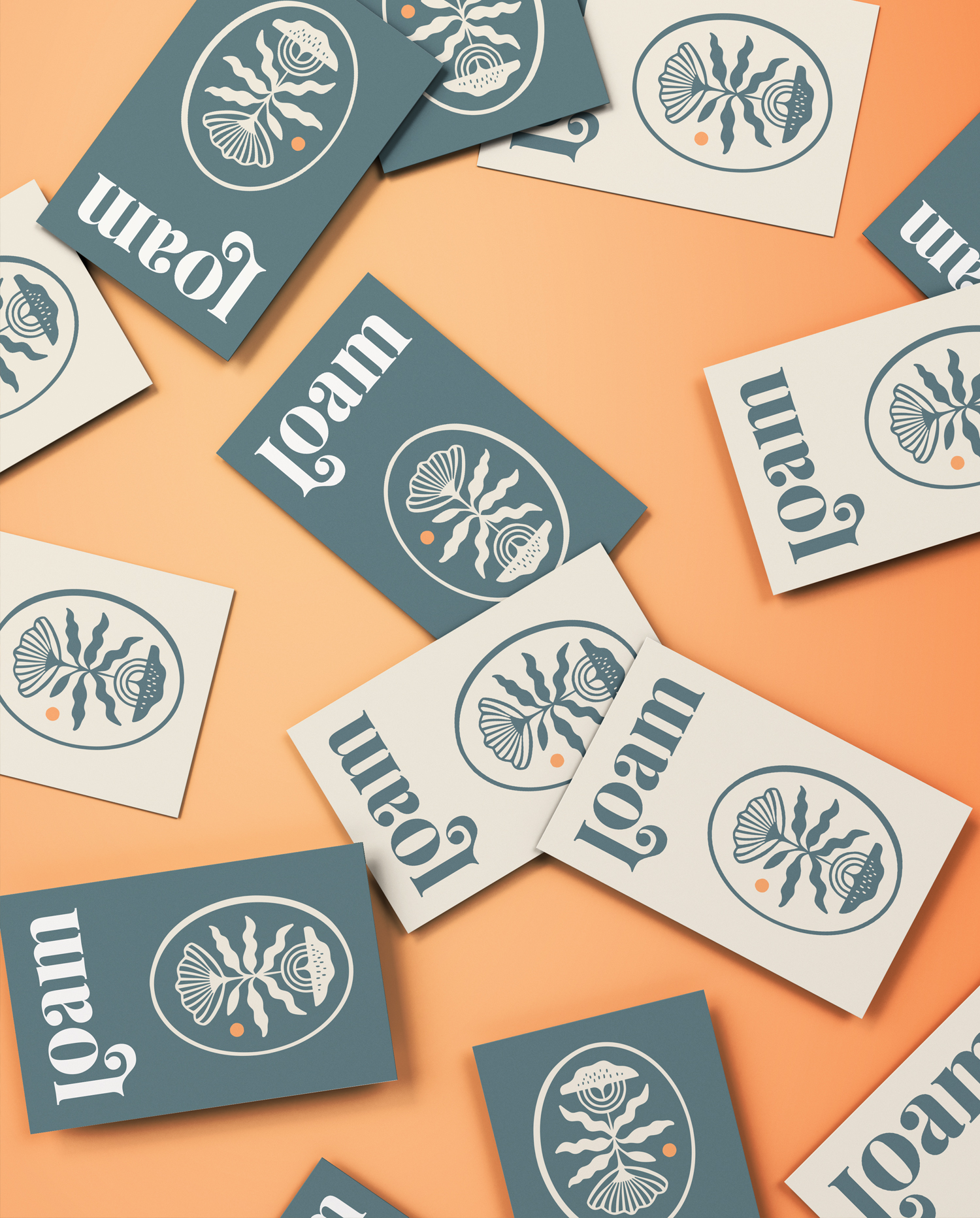
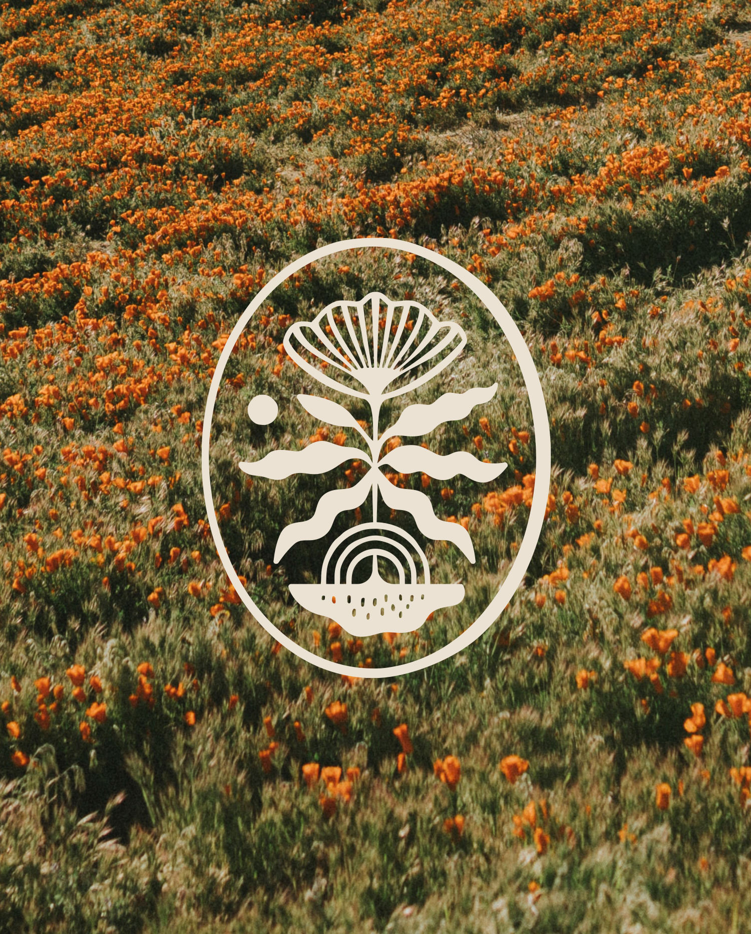
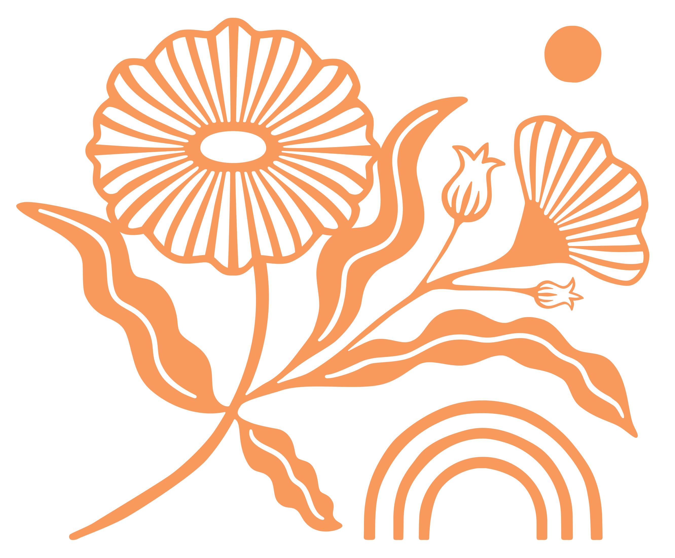
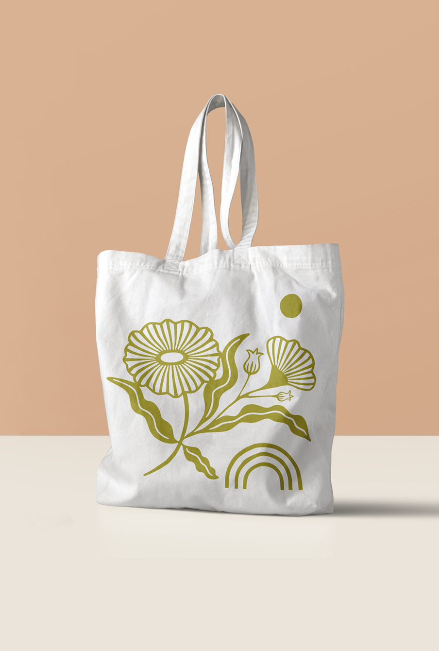
↑ The system of icons corresponds to the pillars of Loam's operations, with the primary icon representing “The Collection of the Whole.”

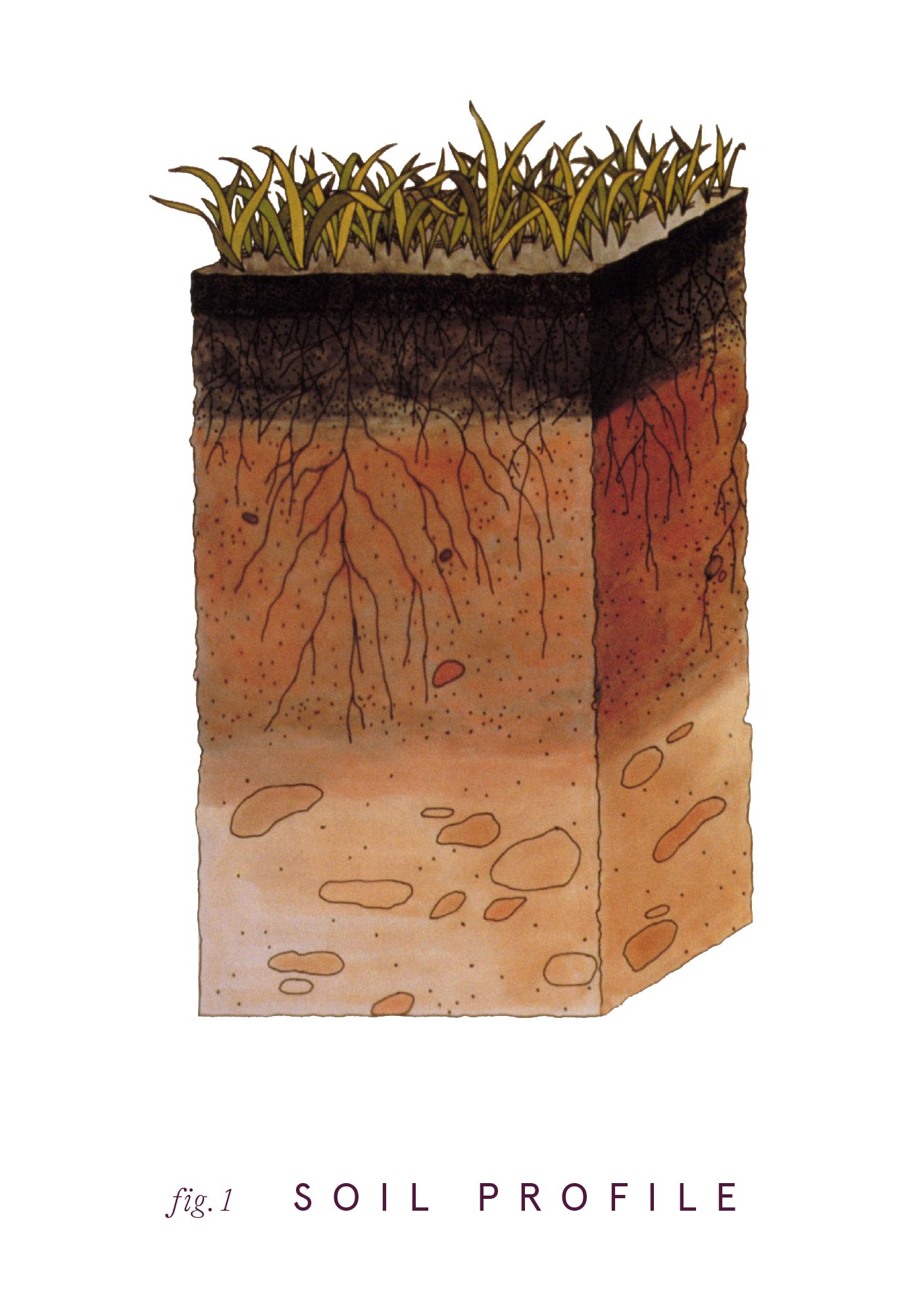
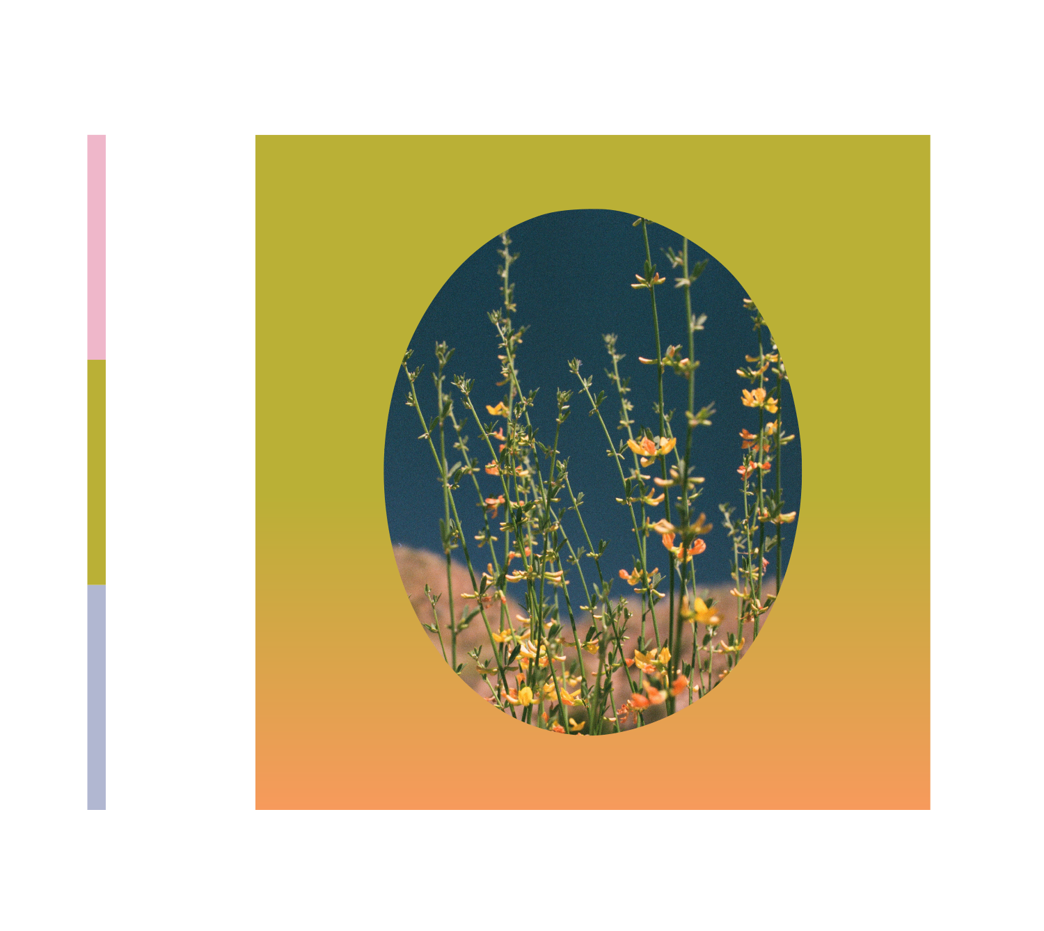
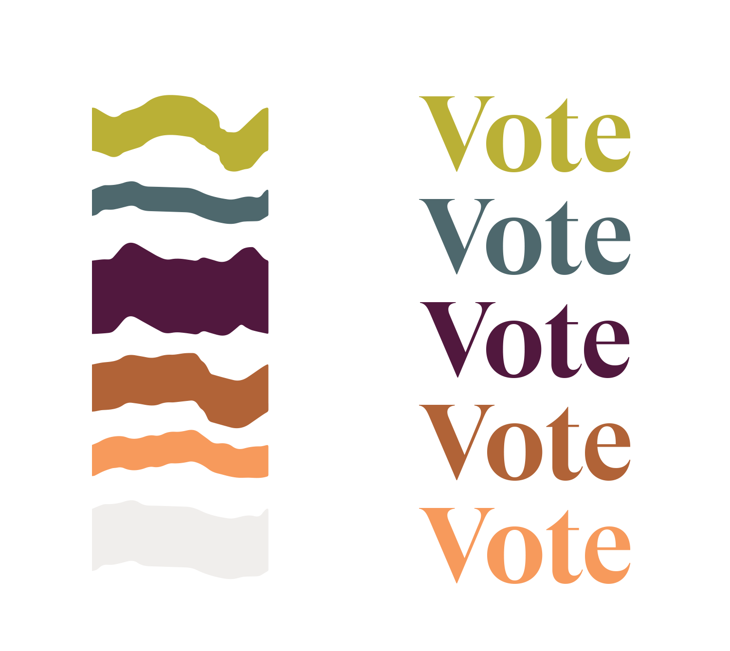
↑ The color palette is inspired by a cross-section of loam (soil) and is used in both blocks of color, gradients, and in specific applications of text.
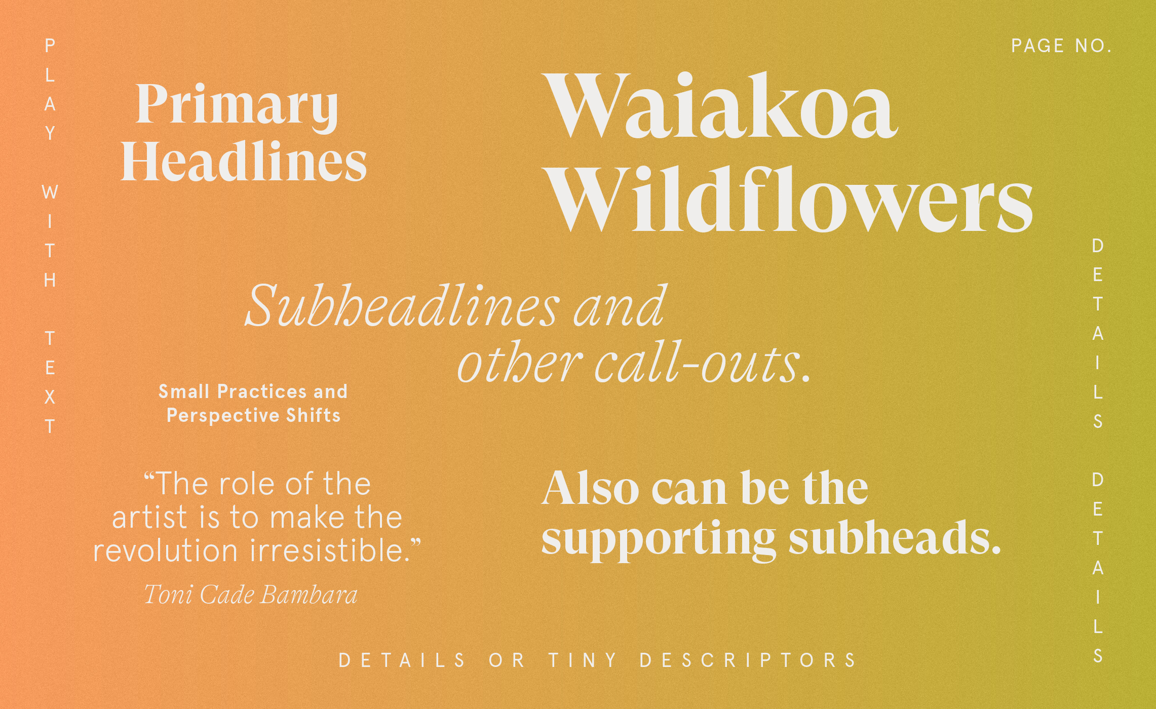
↑ The typographic system was defined in order to let the Loam editorial & design team shine. Welcoming and contrasting type gives room for expression.
“In a time of big change for our organization, working with Noelle was a grounding experience that helped us reconnect to our love for Loam. The thoughtfulness, care, and creativity that she brought into every aspect of the design was so special–it made our team feel SEEN. She has such an exceptional eye for the little details and a bighearted energy that makes every conversation feel like a collaboration. ”
Kate Weiner, Founder & Creative Director
VISIT (BY APPOINTMENT)
Mandarin Plaza, Chinatown
Los Angeles
© E. NOELLE ROTH, 2020
